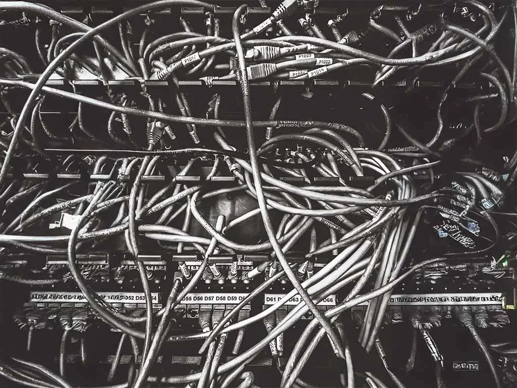
Negative space isn’t empty. It’s powerful.
One of the most common reactions we see to clean, minimal design is panic.
You present a thoughtful, elegant layout and the first response is often:
“Can we fill that space?”
As if every pixel needs to compete for attention.
As if silence equals failure.
But whether we’re talking about visual design, storytelling, or digital marketing, the truth is simple:
Negative space isn’t a void. It’s a strategic tool.
Read more: Marketing brush-off
The Power of the Pause
I started my career in screenwriting and production (hi, I’m Lara—marketing was not the original plan).
One of the first lessons I learned was this:
Silence is never just silence.
Why Pauses Create Impact
A pause in dialogue creates:
- Tension
- Curiosity
- Anticipation
It’s the moment when the audience leans in.
The same principle applies to branding and marketing.
Space creates focus.
A well-placed pause tells your audience:
This is where you pay attention.
Read more: Ad segmentation
When Everything Is Full, Nothing Lands
Overcrowding is one of the fastest ways to lose clarity.
Common Examples of Visual Noise
- A homepage packed with every product or service you’ve ever offered
- A social post trying to be a meme, a pitch, and a mission statement at once
- An email header with multiple fonts, taglines, and quotes competing for space
The result is always the same:
Noise without a message.
When users don’t know where to look, they disengage.
They don’t leave because the design feels empty.
They leave because it feels overwhelming.
Negative Space in Marketing and Branding
At The Darl, we use negative space intentionally.
How We Apply Negative Space Strategically
- We build brand messaging with breathing room so it actually lands
- We design pages and campaigns with clear visual hierarchy
- We use blank space the way a musician uses a rest—so the next note hits harder
We’re not afraid of simplicity.
Or silence.
Because we know the most powerful moments aren’t always the loudest ones.
Sometimes, it’s the space around the message that makes the message stick.

Before You Add One More Element
Before you add:
- Another CTA
- Another paragraph
- Another banner
- Another bold font
Pause.
Let the design breathe.
Let the message speak.
Let it land.
Focus on the one message that truly matters—and give it the space it deserves.
— Lara


