TTLC

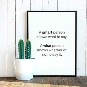
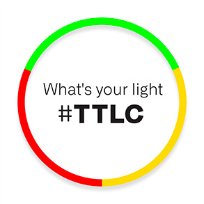
We developed a graphic solution for the project. This aesthetics shows that things don’t need to be complicated in order to work. For the logo, we chose a geometric and simple shape; the circle. This is a reference to traffic lights, but mainly it represents the cicle of life.

Field

Sector

SHORTER VERSION #1
SHORTER VERSION #2

Color Palette

Off-Black

C 00 M 00 Y 00 K 96
R 61 G 49 B 60
#333132

Red

C 00 M 100 Y 79 K 00
R 25 G 160 B 266
#ED1C3C

Orange

C 02 M 10 Y 100 K 00
R 255 G 218 B 00
#FFDA00

Green

C 66 M 00 Y 100 K 00
R 92 G 193 B 31
#5CC11F

White

C 0 M 0 Y 0 K 0
R 255 G 255 B 255
#FFFFFF

CHROMATISM

WEBSITE

This is the
way we
do
posts

This is the
way we
do
stories